Living Room Wallpaper: Looking Good Isn't Enough
You've decided to put wallpaper in your living room. You searched "living room wallpaper" on Pinterest and got hundreds of gorgeous shots. But which one do you actually pick? How will those tropical leaves look in your room? Dark or light? One wall or the whole space?
We hear these questions every single day. And the answer is always the same: a pattern that looks great doesn't suit every living room. Your room's light, its size, your furniture colour and even your ceiling height all shape which pattern is right.
That's exactly why I put this guide together. In seven points I'll walk you through choosing living room wallpaper — not with theory, but with real examples.
1. One Wall or the Whole Room?
This is the question we get asked most. For most living rooms the answer is clear: a single accent wall is enough.
Why? Because once you cover every wall the pattern takes over and the room starts to feel overwhelming. Don't take that risk in living rooms under 20 m² in particular.
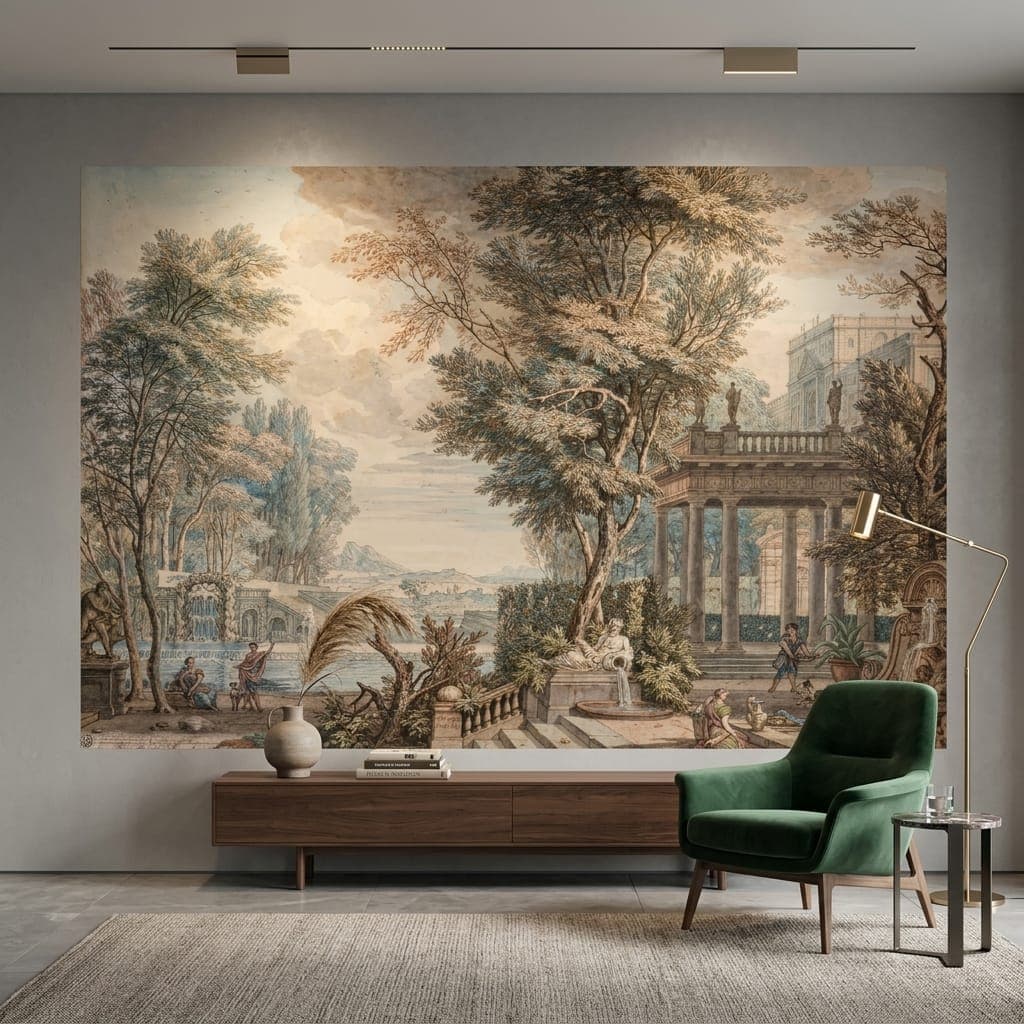
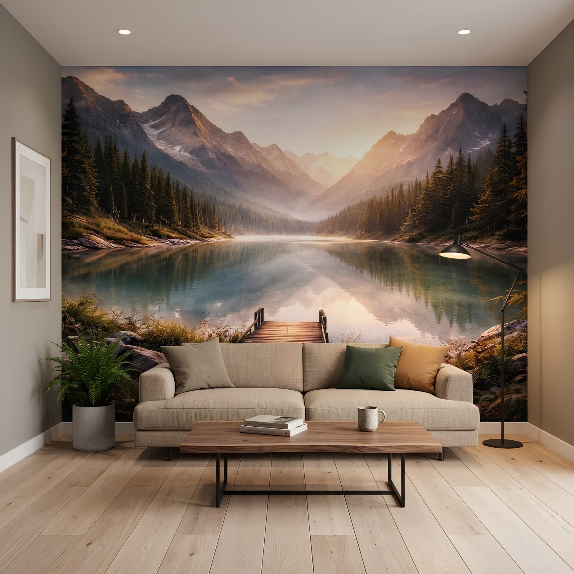
The best spot for an accent wall: behind the TV or behind the sofa. In other words, the first place your eye lands when you walk in. You turn that wall into the "hero wall" and leave the other three in a plain colour.
When does covering the whole room work? Only with very fine, understated patterns — say a thin textured stripe in beige tones or a geometric pattern in neutral colours. The kind that's so minimal that from across the room you can't quite tell whether it's paint or paper.
2. Choosing a Colour: Start From Your Furniture
The most common mistake when picking a wallpaper colour is choosing the paper first and then trying to make the furniture fit it. Do the opposite.
If you have dark furniture (walnut, charcoal): go for light, warm tones — beige, cream, soft green, blush. Let the wallpaper brighten the room.
If you have light furniture (white, oak): you can be bolder. Deep green, navy, even black backgrounds look great. The furniture already provides the contrast.
If you have grey furniture: papers with gold, mustard yellow or terracotta tones work beautifully. They break up the coolness of the grey.
One more tip: what's the accent colour in your furnishings? Is there a colour that repeats in your cushions, your rug or your artwork? If you find that same colour in the wallpaper, the room reads as if it was deliberately "designed".
3. The Trick for Making a Small Living Room Look Bigger
If you have a 15–18 m² living room (about the average in Turkey), you can use wallpaper to enlarge the room optically:
- Scenes with depth: a forest path, a sea view or a city scene with perspective "opens up" the wall. It feels as though the wall keeps going.
- Vertical lines: they make the ceiling look higher. This works wonders especially at a 2.50 m ceiling height.
- Light colours: papers with white, cream or beige backgrounds give a sense of more space.
- Avoid: large patterns on dark backgrounds. Tropical leaves on a black ground are stunning in a 30 m² room and suffocating in a 15 m² one.
4. The 5 Most Popular Living Room Patterns in 2026
I'm saying this based on our customer orders and trend data:
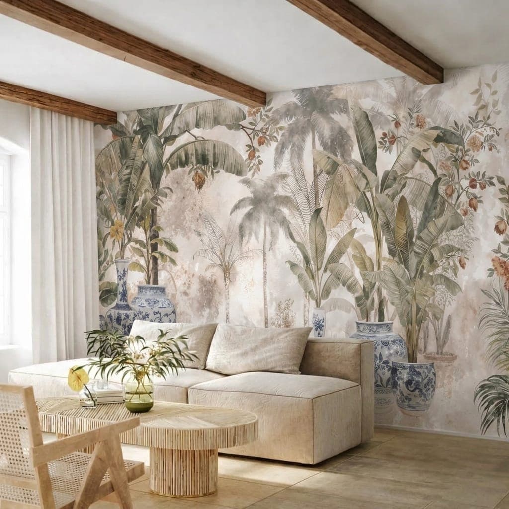
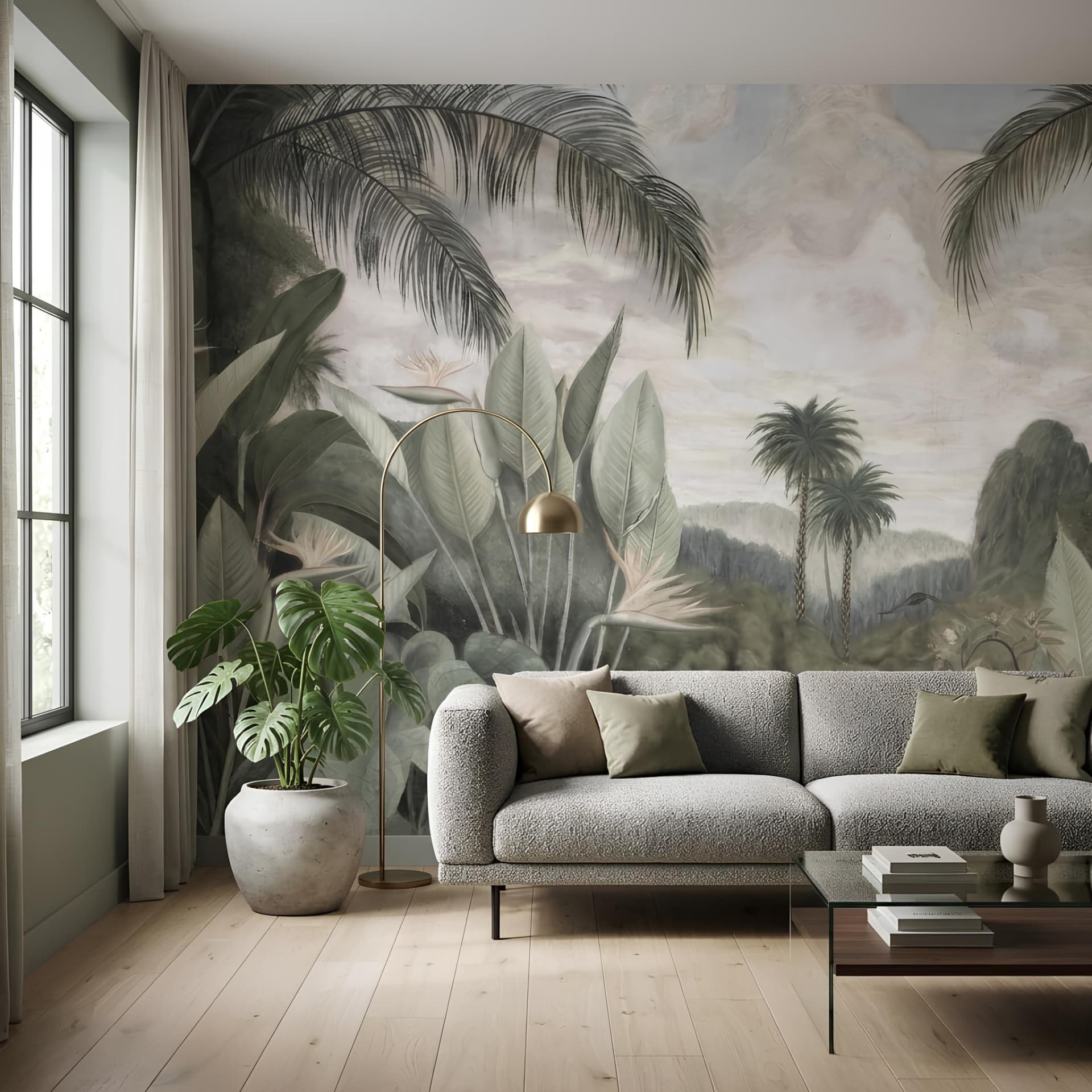
Tropical Botanical
Still in first place. But the dark-ground "jungle" look has given way to calmer botanical patterns on beige and cream backgrounds. The leaves are large but no longer dominant, with breathing space left between them.
Marble and Stone Texture
Real marble cladding takes an impossible budget. But marble-effect digitally printed wallpaper delivers the same impact at a tenth of the price. White-and-grey marble is especially popular behind the TV.
Minimalist Geometric
Fine lines, soft geometric shapes, neutral colours. This pattern doesn't shout "I had wallpaper put up" — but it elevates the room. A perfect match for modern and Scandinavian-style living rooms.
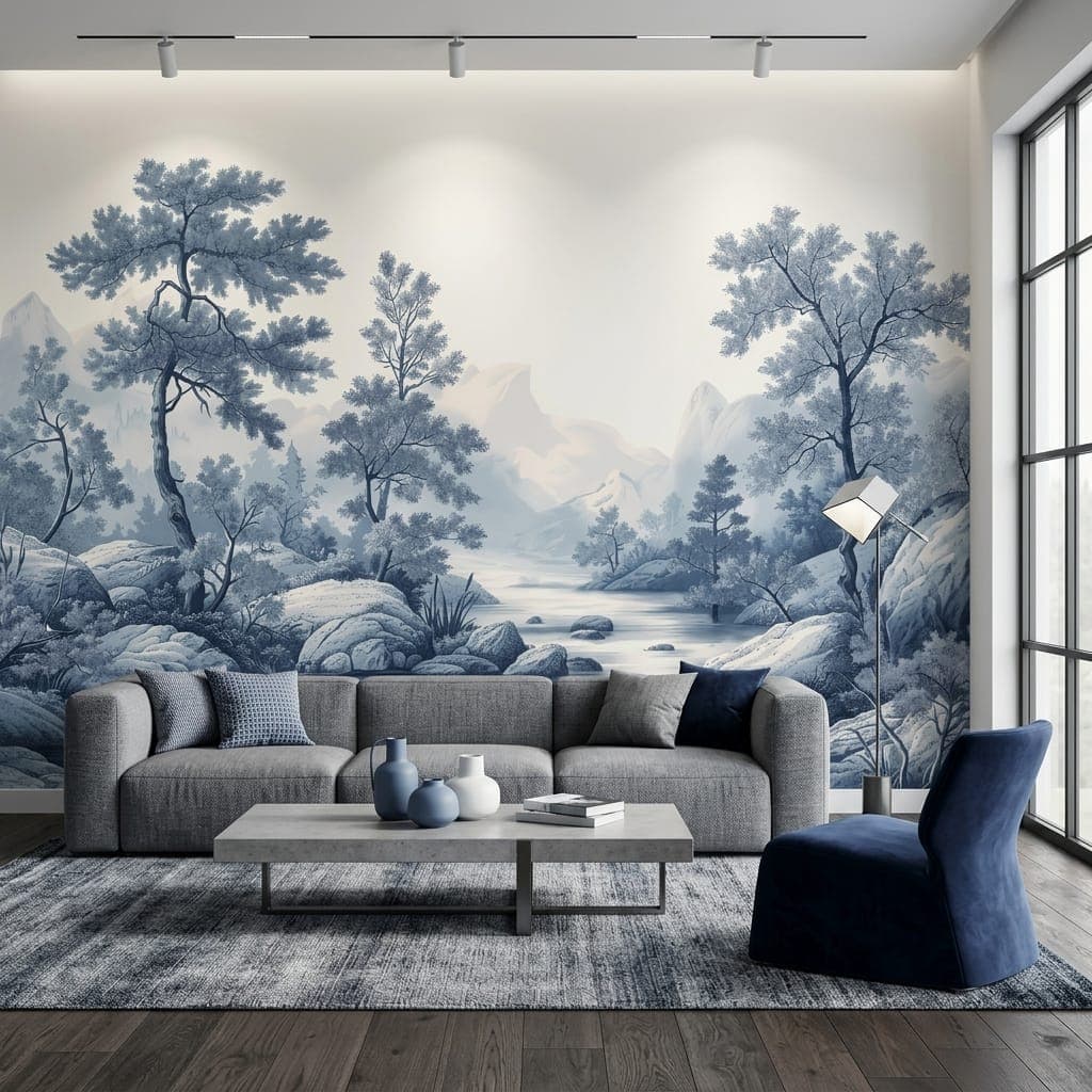
Nature Landscapes
Misty mountains, calm lakes, birch forests. On a single wall these images become the living room's "window". This is the category our customers are happiest with.
Abstract Art
Bold brushstrokes, watercolour effects, fluid abstract forms. These stand out in modern and eclectic living rooms. Abstract patterns in mustard, earthy tones and pastel blues are in high demand in 2026.
5. Choosing the Type of Wallpaper
The paper itself matters just as much as the pattern. For a living room, my recommendation:
- Textile wallpaper: the highest-quality option. Fabric-textured, matte finish, fade-resistant. You can feel the quality when you touch it. The price is a touch higher, but it's worth it.
- Vinyl wallpaper: wipeable, durable, moisture-resistant. A practical choice in homes with children.
- Non-woven: lightweight, easy to hang, affordable. A budget-friendly yet quality middle ground.
If you'd like more detail on canvas and other paper types, take a look at our textile wallpaper hanging guide.
6. Budget Planning
Let's talk real figures. A living room wallpaper budget (2026 prices, single-wall application):
- Small wall (6–8 m²): 540–1,200 TL materials + 600–1,000 TL fitting = 1,140–2,200 TL
- Medium wall (10–14 m²): 900–2,100 TL materials + 800–1,500 TL fitting = 1,700–3,600 TL
- Large wall (16–20 m²): 1,440–3,000 TL materials + 1,200–2,000 TL fitting = 2,640–5,000 TL
For comparison: a painter would charge around 1,500–3,000 TL to paint the same wall. So wallpaper costs roughly the same as paint — but leaves a far bigger aesthetic impression.
For more detail on pricing: Wallpaper price guide
7. The 3 Most Common Mistakes
Finally, the mistakes we see most often when people choose living room wallpaper:
Mistake 1: Choosing from a phone screen
A pattern that looks great on a 5-inch screen feels completely different on a 4-metre wall. If you can, ask for a sample or view it on a big screen (TV, computer). Even better if you project it onto your own wall.
Mistake 2: Ignoring the light
Does your living room face north or south? In north-facing rooms cool colours (blue, grey) make the space gloomier still. Go for warm tones. In south-facing rooms light colours can look too bright — mid-tones give a better result.
Mistake 3: Following a trend and forgetting your own taste
Don't buy tropical leaves just because they're on trend. If you're a minimalist at heart, that wall will wear you out within three months. Trends pass, your taste stays. If a pattern you love will still make you happy ten years from now — that's the right choice.
Conclusion
Choosing living room wallpaper should be an enjoyable process, not a stressful one. Start with a single wall, pick a colour that suits your furniture, and factor in your room's size and light. The pattern takes care of the rest.
If you'd like some inspiration for your living room:
- Living room wallpaper collection
- Nature-themed landscapes
- Wallpaper or paint? A comparison guide
- Wallpaper selection guide
Bonus Tip: Pattern Direction by Ceiling Height
Let's add a field-tested eighth point to the seven tips. In living rooms with a ceiling under 2.5 metres, vertically rhythmic patterns (tall leaves, linear textures) raise the ceiling visually; in rooms with high ceilings above 3 metres, horizontally flowing landscape compositions balance the space. Checking the ceiling measurement before you pick a pattern heads off the "the paper's lovely but the room feels low" complaint from the start.
Final Check: The Light Test
Before you buy the sample you've settled on, watch it in the living room under three lights: morning daylight, evening ceiling lighting, and with the TV/LED strip on. If the pattern's background colour looks like it belongs to the same family in all three lights, the choice is sound; tones that shift towards yellow or green in the evening light are the detail that produces the most regret in living rooms. This five-minute test prevents more mistakes than all seven tips combined.