Loading article…
scandinavian wallpapernordic wallpaperhygge interior
Scandinavian Wallpaper: A Bright Home With Little Light
The secret behind Nordic homes that feel bright even with little daylight: pale colours, nature motifs and hygge warmth. How to choose Scandinavian wallpaper, room by room.
D
By Dekoartizan Tasarım Ekibi··5 min read
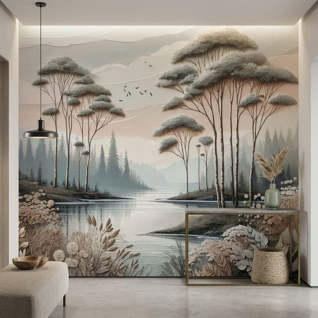
Scandinavian wallpaper starts with one word: light. Up north the winter is long and dark, so interiors are built to reflect and multiply every bit of brightness — pale surfaces, clean lines, natural materials. Alongside it sits hygge, the name for a life that is simple yet warm, understated yet calm.
The lesson for your walls is clear: a backdrop that feels airy without being cold, plain without being lifeless. We see exactly where it earns its keep — north-facing rooms, spaces that get little sun, and small flats. For the dim rooms inside an apartment, Scandinavian is the safest brightening choice we have tried.
Light and hygge: the philosophy behind it
Nordic design doesn't waste light, it reclaims it. A pale backdrop bounces incoming daylight, a simple pattern rests the eye, and a nature theme carries that "open air" feeling. Hygge then adds warmth to the simplicity; the home becomes sparse yet never feels empty. That balance is precisely why Scandinavian style is loved the world over.
The Scandinavian colour palette
- Pure and off-white: the base that reflects the most light; it visibly enlarges a small room.
- Light, cool grey: the calm backbone of modern Nordic.
- Soft pastel accents: dusty blue, sage, pale pink — cheerful but gentle.
- Natural wood and beige: the tones that build hygge warmth.
To see the trick of using a pale backdrop to stretch a small room in more detail, take a look at our small-room guide.
The most-loved Nordic patterns
A Scandinavian pattern means "few and natural." The ones chosen most often in practice:
- Forest and trees: faded birch, pine silhouettes. Loved in living rooms and the children's room.
- Simple botanicals: fine leaves, sparse branches. Ideal for the bedroom and the entrance.
- Minimal geometry: thin lines, triangles, dots. Works in the home office and a modern living room.
- Folk motifs: plain Scandinavian folk patterns. Add cheer to the kitchen and dining nook.
Forest themes are most requested in the children's room, while simple botanicals shine in the bedroom.
| Nordic pattern | Base that suits it | Best room |
|---|---|---|
| Birch / forest silhouette | Matte non-woven | Living room, children's room |
| Simple botanicals | Matte textile | Bedroom, entrance |
| Minimal geometry | Smooth non-woven | Home office, modern living room |
| Folk motifs | Wipe-clean vinyl | Kitchen, dining nook |
Why Scandinavian wallpaper suits a low-light room
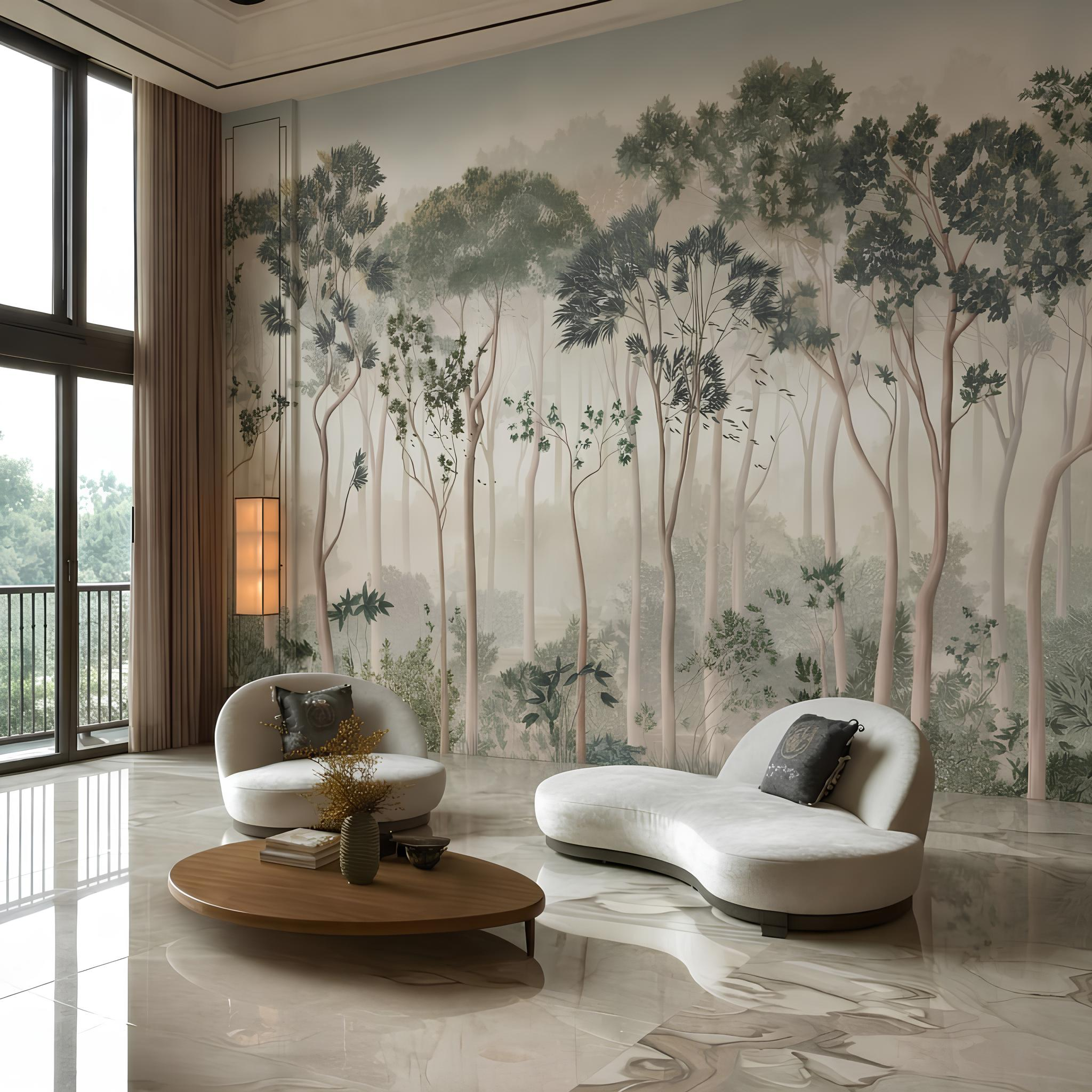
This is where the most practical benefit of Scandinavian style comes together. North-facing rooms, spaces that get little sun, or small rooms visibly open up with a pale Nordic palette and a simple pattern. Avoiding dark, busy designs and leaning towards nature themes on a pale backdrop makes a cramped flat feel larger. In most Turkish apartments, this is the solution that pays off fastest.
Which room calls for Scandinavian?
- Living room: a faded forest or mountain view on a single wall; it blends with light wooden furniture. Living-room guide.
- Children's room: a birch forest and sweet animal motifs — simple and sleep-friendly. Children's-room guide.
- Bedroom: fine botanicals or minimal geometry; calm and bright.
- Kitchen / dining nook: folk motifs liven things up; a wipeable base keeps it practical.
It doesn't work without hygge touches
A Scandinavian wall can feel a little bare on its own; warm textiles complete it. Knitted wool, sheepskin, natural linen, light wood; candles, a ceramic vase and a few simple green plants. The colour comes not from the wall but from one or two soft accents. "Few things, lots of light, natural texture" — the whole style in a single sentence.
A real-room example
Picture a 12 m² bedroom that faces north and stays dim all day — a fairly common situation in Turkey. Here a dark pattern would shrink the room even further. An off-white backdrop with a wall of fine birch silhouettes, light wood opposite it and one or two dusty-blue textiles: the room both brightens and escapes being a "characterless white box." Put an anthracite geometric wall in the same room and it would turn into a cave by evening light.
A style that breathes with the seasons
The lovely thing about Scandinavian is that the wall stays put while the room can change with the season. In winter you wrap it in knitted wool, sheepskin and warm light; in summer you cool the same wall down with linen and pale-toned textiles. Because the wall stays neutral and natural, it grounds both moods. That is exactly why a Nordic wallpaper counts as a choice you keep for years rather than one you swap out when you get bored.
Price and production
Scandinavian models are produced at the standard rate. On pale-backdrop, large-scale patterns, UV printing gives an even, cloud-free result. For current per-m² prices, see our price guide; if you would like to print your own nature photograph (forest, lake) in a Nordic palette, head over to the custom design side.
Frequently asked questions
Does Scandinavian wallpaper make a small room look bigger?
Yes. A pale backdrop reflects light and a simple pattern rests the eye. It is the most brightening choice for north-facing and small rooms.
What is the difference between Scandinavian and Japandi?
Scandinavian is paler, brighter and carries hygge warmth; Japandi is more earth-toned, matt and steeped in wabi-sabi depth. The two are related, but one is about "light" and the other about "calm."
Which colours count as Scandinavian?
White, off-white and light-cool grey form the base; dusty blue, sage and pale pink are the accents; natural wood and beige add the warmth.
Does Scandinavian style end up cold or boring?
It can if it's done wrong. The fix is hygge touches: natural textiles, wood and a single warm accent make the style liveable.
From our shop
Wallpapers You Might Like
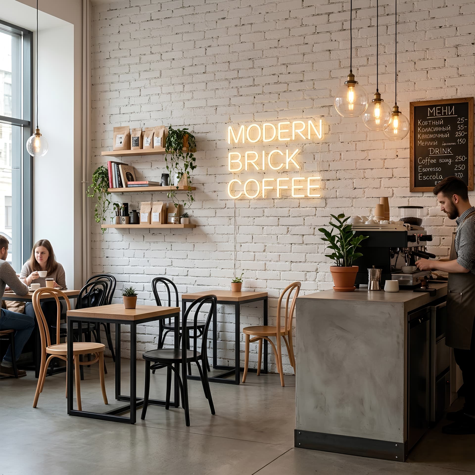
3D White Stone Brick Textile Wallpaper
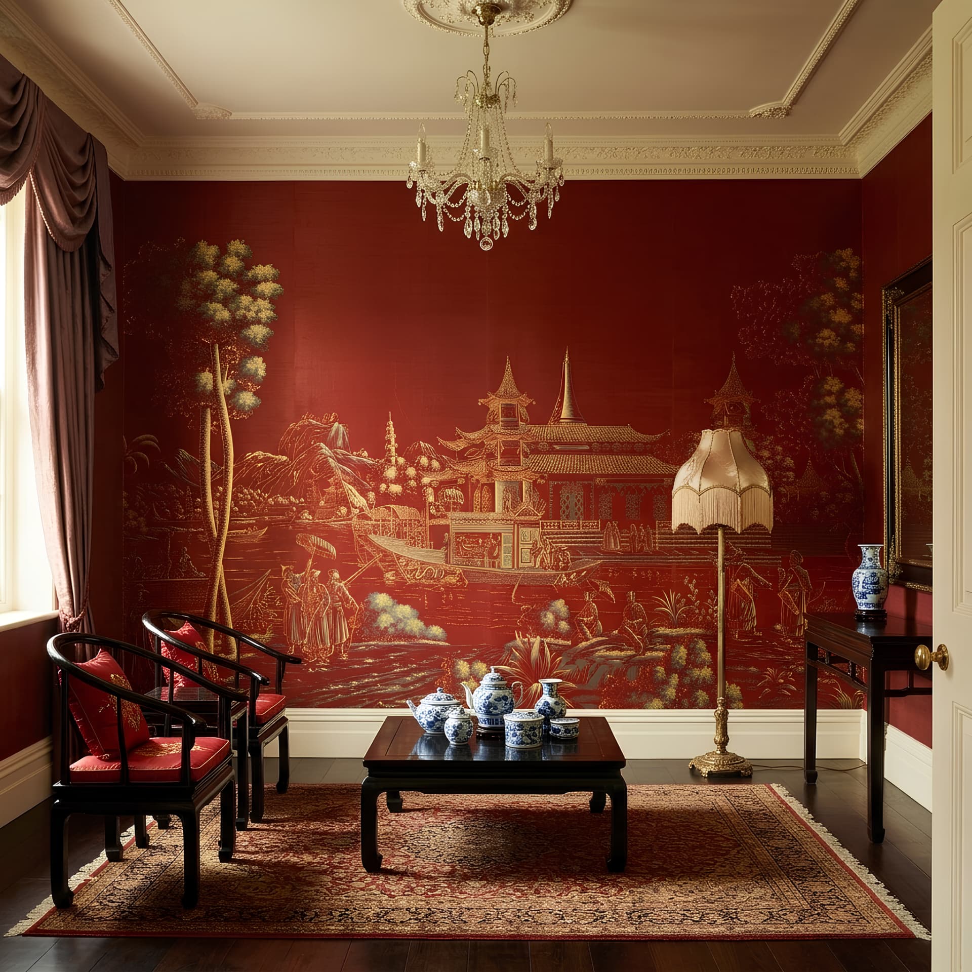
Classic Chinese Motif Burgundy Wallpaper
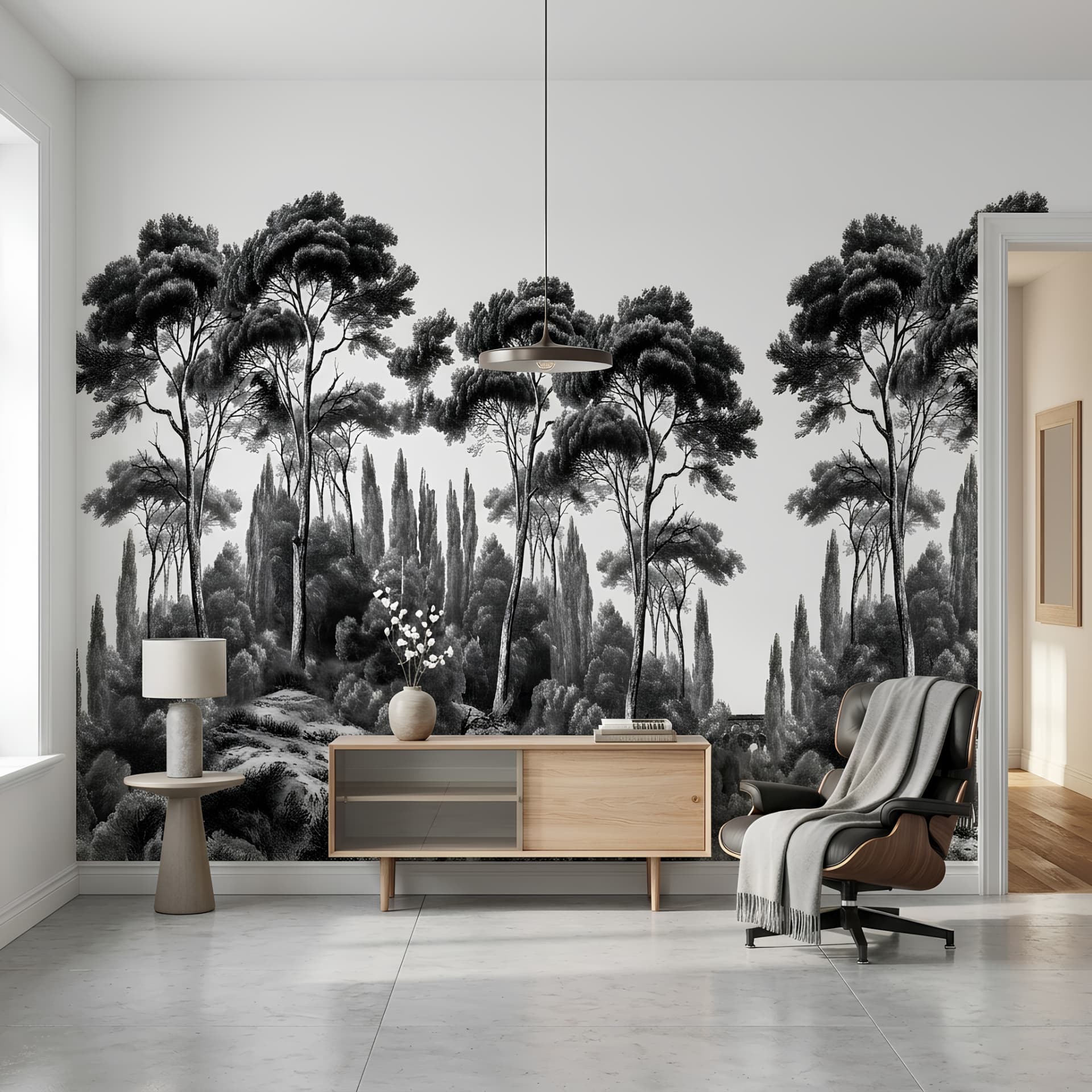
Black & White Vintage Forest Wipeable Wallpaper
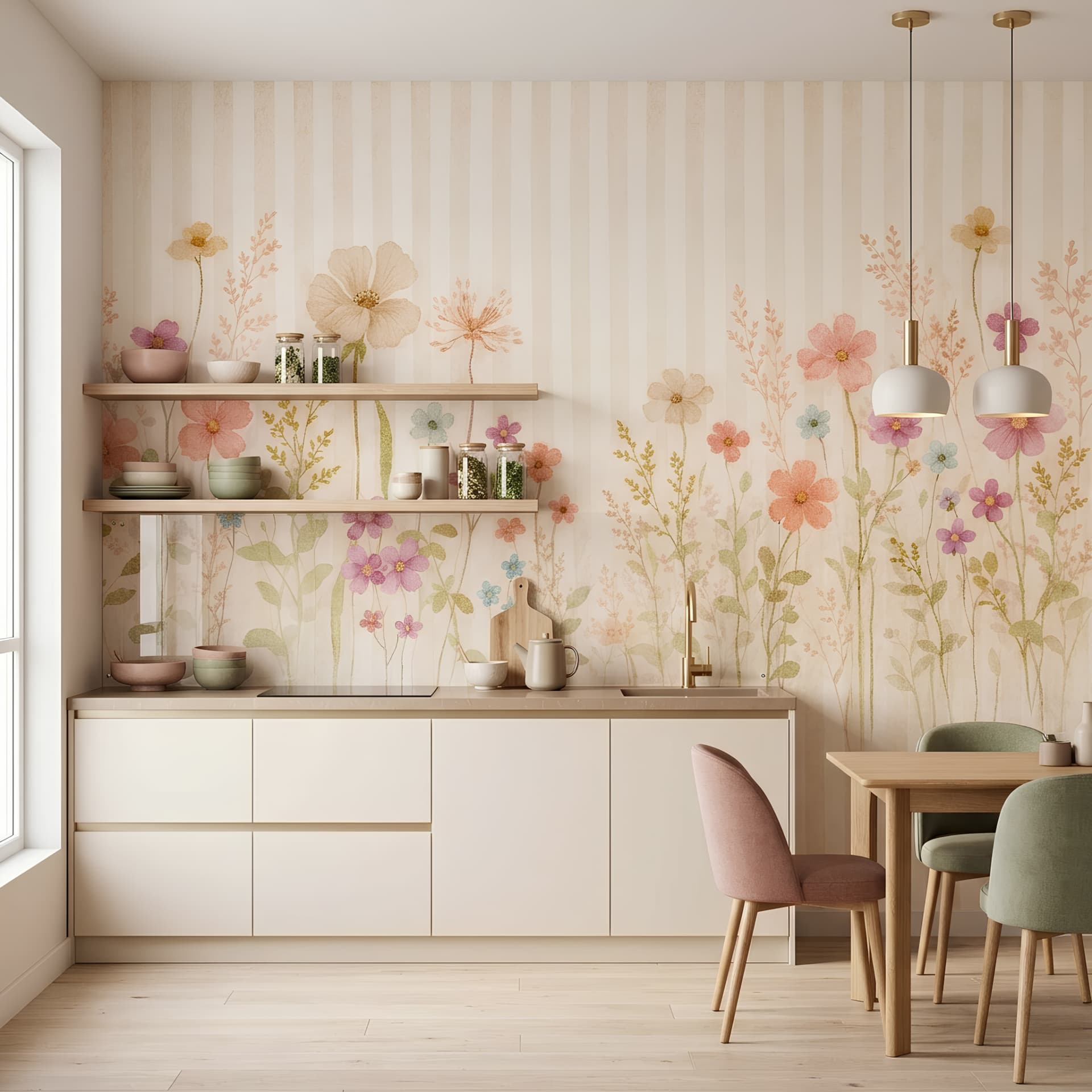
Pastel Spring Garden Striped Wallpaper
DA
Dekoartizan Tasarım Ekibi
Duvar kağıdı sektöründe uzmanlaşmış tasarım ve içerik ekibimiz, iç mekan dekorasyonu, malzeme bilgisi ve uygulama teknikleri konusundaki birikimlerini bu rehberlerde paylaşıyor. Tüm içerikler saha deneyimi ve güncel sektör verileriyle desteklenir.
İçeriklerimiz saha deneyimi ve sektörel uzmanlığa dayanır
scandinavian wallpapernordic wallpaperhygge interiornature wallpaperbirch tree wallpaperminimalist wallpaper