Most people who hear "Japandi" for the first time ask the same thing: "Is this just another pattern trend?" It isn't. Japandi isn't a style of adding, it's a style of taking away — it brings the quiet calm of Japanese wabi-sabi together with the functionality of Scandinavian design on the same wall.
In practice that means you choose wallpaper by texture, not by pattern. Earthy tones, matte surfaces, fine organic lines, a faded mountain silhouette or a plain linen look. The goal isn't to make the wall the star, it's to lay a quiet backdrop for the room. The line we hear most from customers sits right in this sweet spot: "I don't want it to shout, but I don't want a bare wall either."
Why is Japandi catching on so fast?
It's the meeting of two ideas. One is wabi-sabi: the view that treats a cracked ceramic, an uneven handwoven cloth or a faded colour as character, not flaw. The other is the Scandinavian notion of lagom: not too much, not too little, just enough. Translated to a wall, it reads like this — empty space is a design decision too.
That's why Japandi papers don't give you a pattern you read with your eyes, but a texture you only notice when light catches it: linen weave, paper fibre, a brush stroke. For anyone with a busy, full home looking for "a corner where the eye can rest", this is the first direction they turn to.
The colours come from nature, and none of them shout
The Japandi palette is low in saturation and entirely natural:
- Warm neutrals — sand beige, clay, oatmeal. The calm foundation of the room.
- Charcoal and ink — the depth that comes from Japanese aesthetics; it builds contrast in measured doses.
- Sage and olive green — nature's quiet accent.
- Faded terracotta — the earthy warmth of wabi-sabi.
This palette is restful in the bedroom and in work corners, while in the living room it stays timeless.
In Japandi, texture comes before pattern
It isn't which pattern you choose that matters, but which surface. A few directions work best on site:
- Plain linen or paper texture: a textured ground with no pattern. This delivers the "breathing wall" effect in its purest form.
- Fine organic line: hand-drawn curves, a gentle sand or water ripple. There's movement, but it stays calm.
- Bamboo or slender branch: sparsely placed, minimal botanical. It connects with nature without crowding the room.
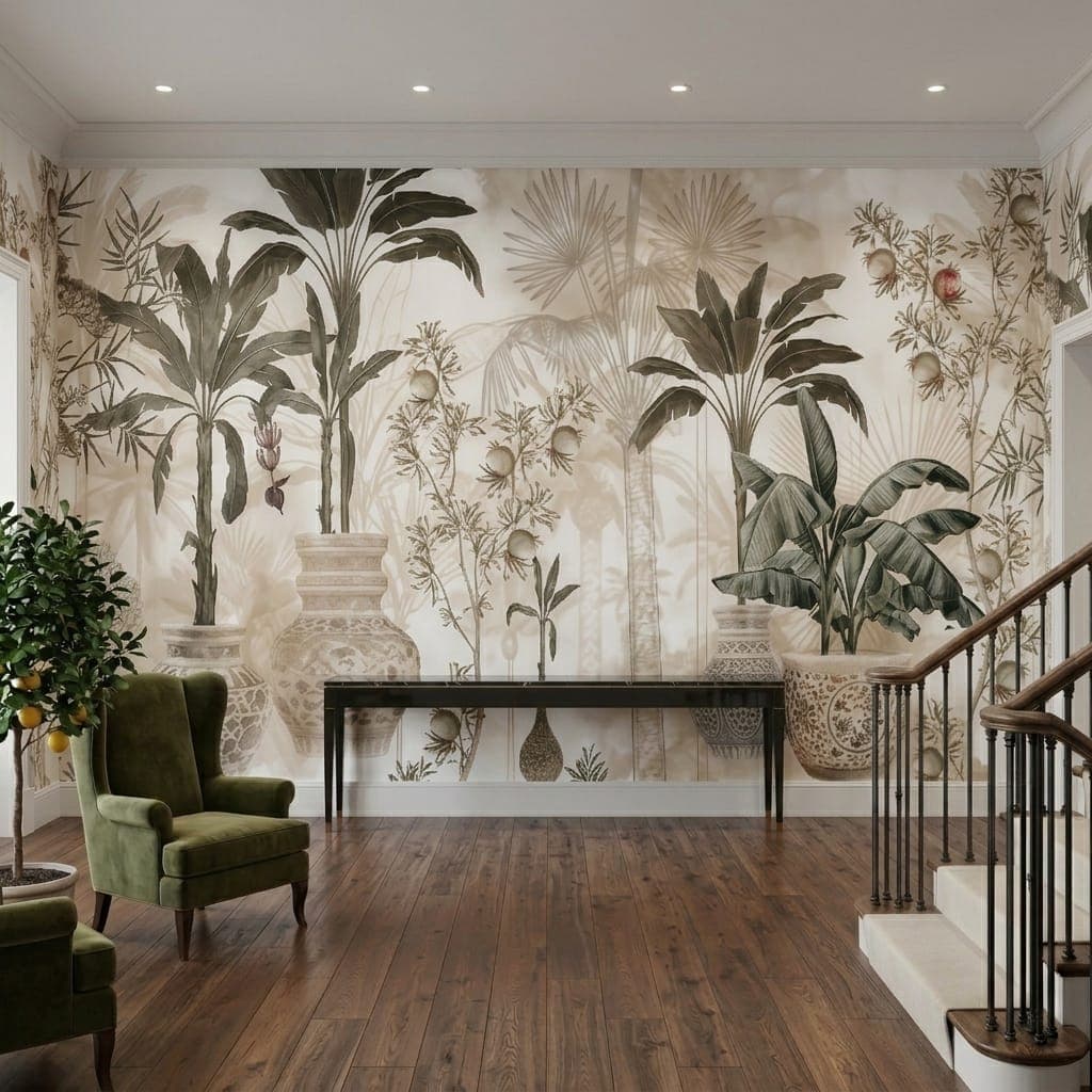
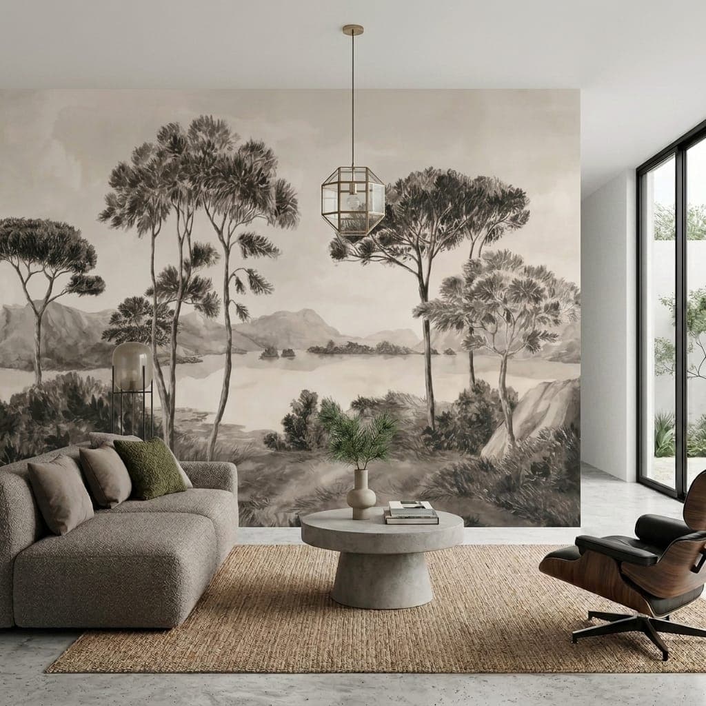
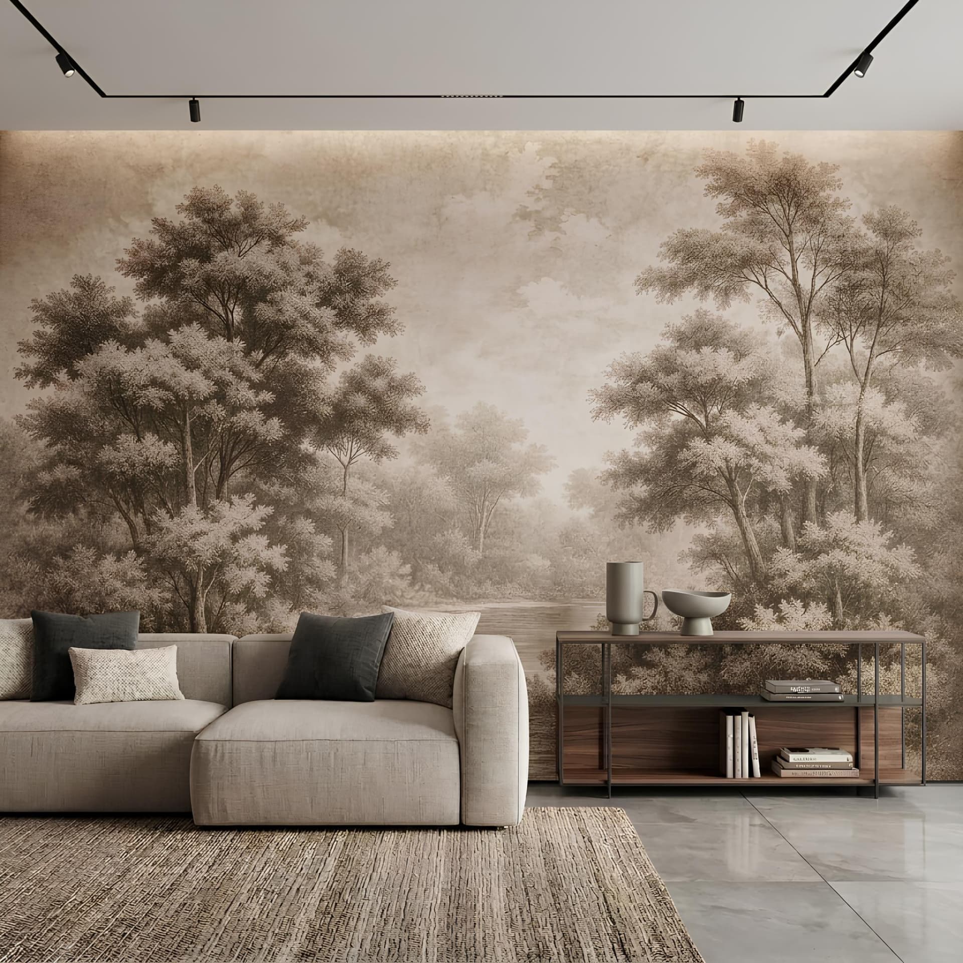
- Faded mountain/mist silhouette: a layered yet hazy landscape; it brings depth and stillness to the room.
These surfaces look most realistic on a matte textile base — for the detail, see our textile wallpaper guide. A large mountain silhouette printed as a single piece works on the logic of a wall mural.
Which room can carry Japandi?
Almost any space, really, but some fit it perfectly:
- Bedroom: the heart of Japandi. A faded mountain silhouette or a plain linen texture builds the kind of silence that invites sleep.
- Home office: a textured ground that doesn't distract is easy on the eyes in front of a screen. Ideal for working from home.
- Living room: a fine organic line on a single feature wall; it blends with light wood and linen furniture.
- Entryway: a single panel with a sumi-e (Japanese ink painting) feel that says "calm down" the moment you walk in.
Matching materials and furniture
In Japandi, material matters more than pattern. The rule is simple: no glossy surfaces. A matte textile or matte non-woven base is the choice that carries the natural feel of the style best. For furniture, light wood, linen, rattan and ceramic; if you use metal, make it matte black. Few objects, plenty of space — Japandi is built on "editing" the room, not "filling" it. As for greenery, a single bonsai or a tuft of pampas is enough; an accent, not a crowd.
Price and the production side
Japandi textures are produced at the standard rate; textile and canvas bases are the surfaces that carry the natural feel of this style best. You can work out current per-m² prices and the total room cost from the price guide, and the measurement calculation from the m² calculation page. If you want to print your own sumi-e piece or a mountain photo of yours to your wall's exact size, the custom design side is exactly for that.
The three most common mistakes in Japandi
- Layering on too much "theme": packing bonsai, bamboo, sumi-e and a mountain silhouette into the same room isn't Japandi, it's a "Japan-themed room". Pick one texture and leave the rest to empty space.
- Defaulting to pure white: a white wall is Scandinavian, not Japandi. The foundation of Japandi is warm neutrals — sand, clay, oatmeal. Pure white reads cold in this style.
- Choosing a glossy surface: the mistake we see most often on site. Glossy lamination kills the whole natural feel of Japandi in an instant. A matte base is a must.
A combination that has been tested
A simple recipe that works for the bedroom: a linen-textured base in faded sand at the headboard wall, a light oak nightstand beside it, a matte black reading lamp above, and a single dried pampas in the corner. Four elements, one colour family — this is exactly where Japandi's "less but enough" logic comes from. The moment you add a fifth pattern to the same room, the balance breaks; so before you add anything, always try "taking something away".
The difference between Japandi, Scandinavian and pure minimalism
The three are related but not the same. Pure minimalism can sometimes feel cold and empty. Scandinavian is lighter, brighter and carries hygge warmth. Japandi sits between the two: the simplicity of minimalism, natural warmth and wabi-sabi depth all at once. In short, Japandi is "warm minimalism".
Frequently asked questions
What exactly is Japandi wallpaper?
It's a calm style that combines the simplicity of Japanese wabi-sabi with Scandinavian minimalism, built on natural textures and earthy tones. It offers texture and tranquillity, not a showy pattern.
Which room suits Japandi best?
The bedroom and the home office lead the way; it works in any space that calls for calm and focus. It also stays timeless in the living room and entryway.
Are Japandi and Scandinavian the same thing?
No. Scandinavian is lighter, brighter and hygge-focused; Japandi is more earthy-toned, matte and carries wabi-sabi depth. Nordic says "light", Japandi says "stillness".
Can a Japandi wall have a glossy surface?
It's not recommended. Japandi lives in matte texture; a glossy surface ruins the natural feel. Choose a textile or matte non-woven base.